
 |
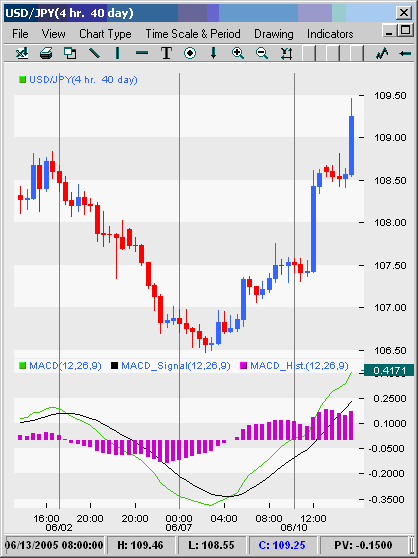
| Figure 1: MACD histogram. Asprice action (top part of the screen) accelerates to the downside, theMACD histogram (in the lower part of the screen) makes new lows |
| Source: FXTrek Intellicharts |
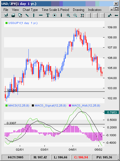 |
| Figure 2: a typical (negative) divergence trade using a MACD histogram. At the right-hand circle on the price chart, the pricemovements make a new swing high, but at the corresponding circled pointon the MACD histogram, the MACD histogram is unable to exceed itsprevious high of 0.3307. (The histogram reached this high at the pointindicated by the lower left-hand circle.) The divergence is a signalthat the price is about to reverse at the new high, and as such, it isa signal for the trader to enter into a short position. |
| Source: Source: FXTrek Intellicharts |
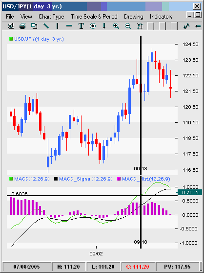 |
| Figure3: A typical divergence fakeout. Strong divergence is illustrated bythe right circle (at the bottom of the chart) by the vertical line, but traders who set their stops at swing highs would have been taken out of the trade before it turned in their direction. |
| Source: Source: FXTrek Intellicharts |
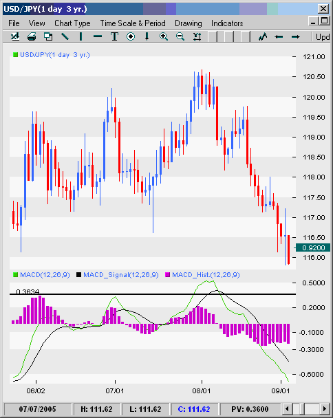 |
| Figure4: The chart indicates where price makes successive highs but the MACDhistogram does not - foreshadowing the decline that eventually comes.By averaging up his or her short, the trader eventually earns ahandsome profit as we see the price making a sustained reversal afterthe final point of divergence. |
| Source: Source: FXTrek Intellicharts |
| 欢迎光临 华人论坛 (http://stock.yayabay.com/forum/) | Powered by Discuz! 7.2 |